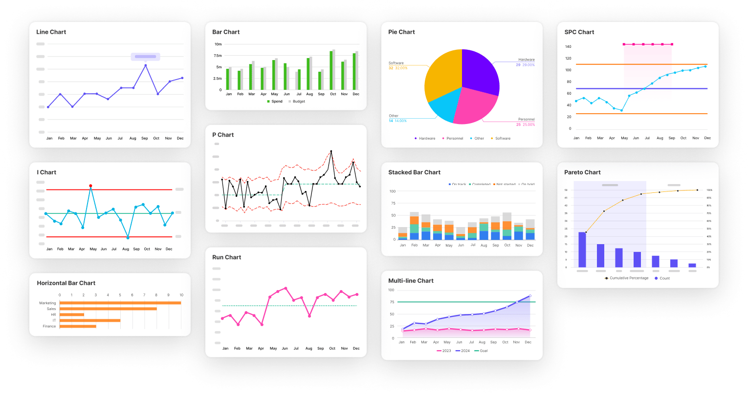
All your charts in one place
Pick from a wide range of charts and have your data visualised in a few seconds. From bar and pie charts to statistical analysis - Simana has it all.
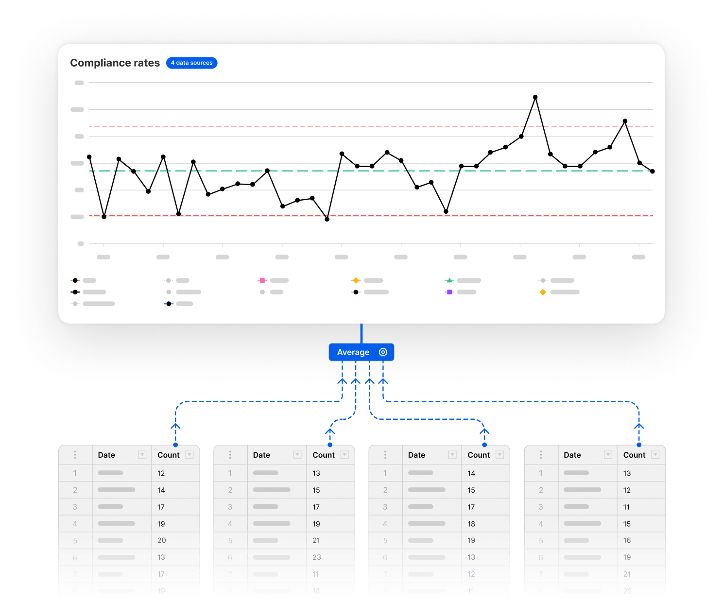
Automated data aggregation
Bring together your data from multiple sources and watch it aggregate automatically. Giving you a clear picture of the detail and overall impact of your improvements.
Statistical analysis made easy
Simana analyses the variation in your data and alerts you to statistically significant changes. Allowing you to easily monitor where your changes are causing significant variations to the process you are monitoring. Giving you statistical proof you are improving!

Outlier

Shift

Trend

High Variation

Low Variation
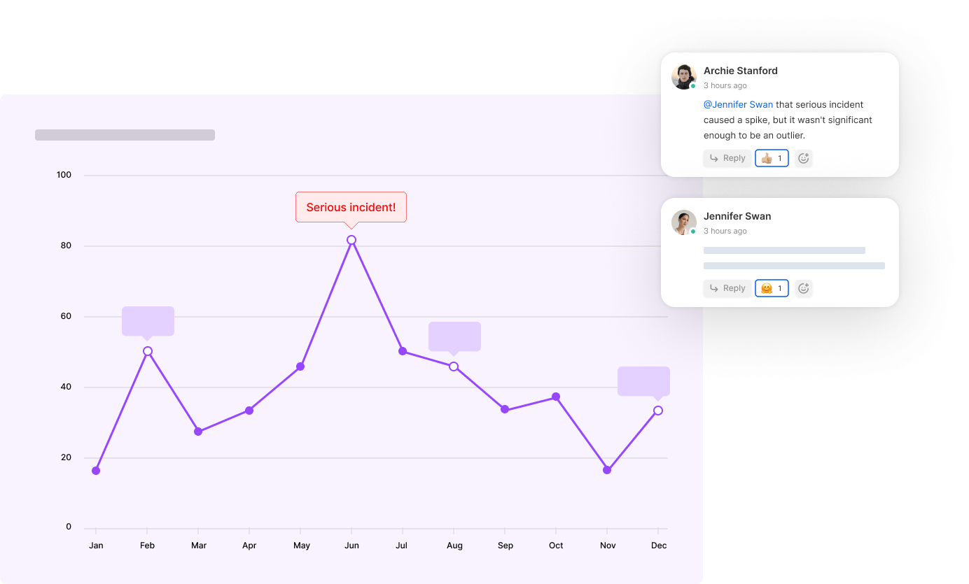
Annotate key events
Bring your data to life. By visualising your PDSA cycles on your charts and adding notes you can annotate key events, allowing colleagues to understand and interpret your work with ease.
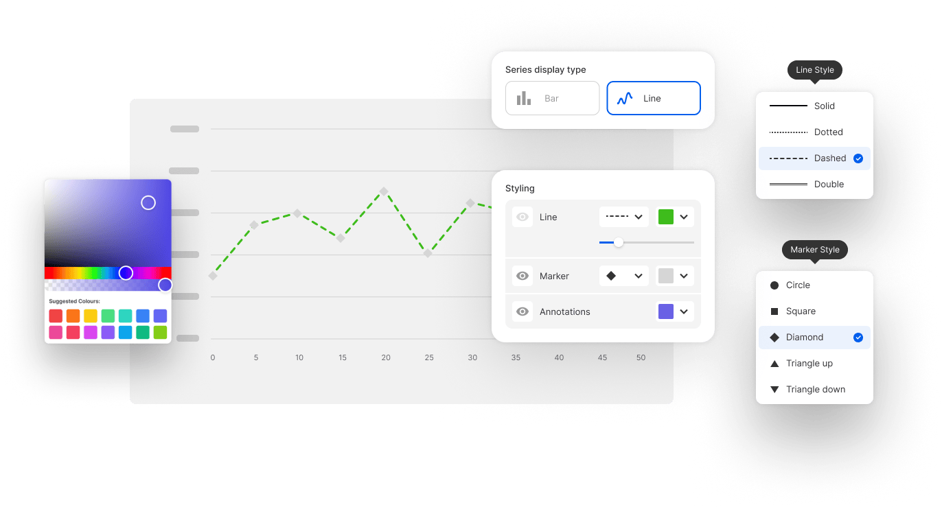
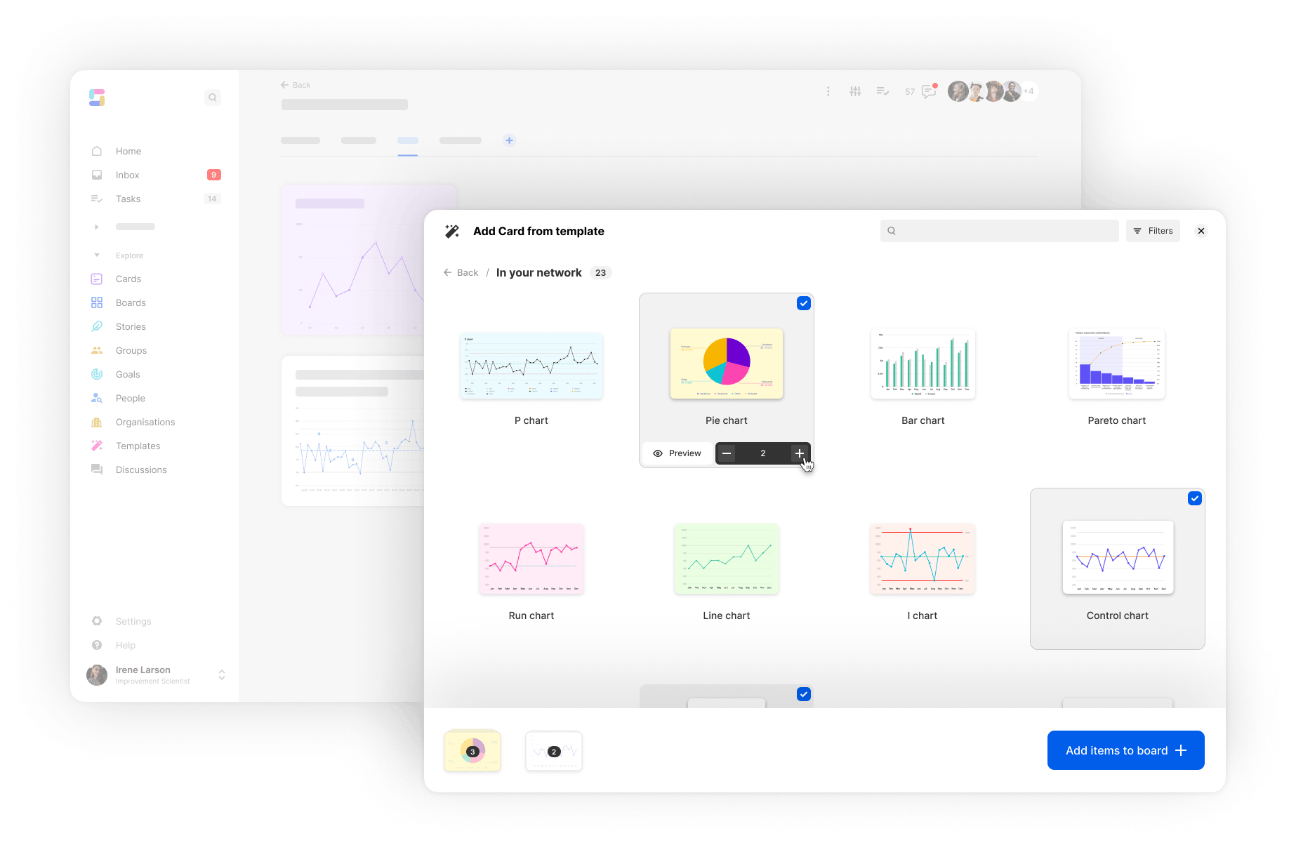
Customise Charts
Customise the look of your charts by picking colours, creating labels, setting axis limits and toggling on/off lines. Even add goal lines to visualise the target improvement.
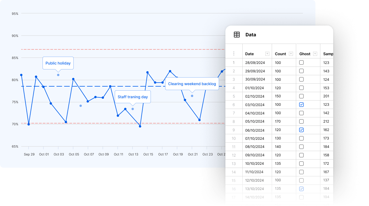
Ghosting
Need to exclude some data points from your charts? Leave your data visible on the chart, but exclude the selected data from the calculation of the median, mean, and any control limits. It’s all done with the click of a button.

Use Charts to:
- Visually track metrics over time with interactive charts and graphs
- Gain insights into trends and patterns at a glance
- Control ongoing projects, find and correct problems as they occur
- Predict the expected outcomes of your improvement
- Monitor the project to see if it is under control
- Analyse the cause of any variation in the data

Start improving with Simana today
Start a free trial or book a demo